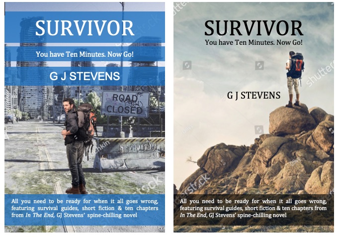
I need your help. Which cover image for my new novella fiction / non-fiction hybrid?
These are mockups. I will develop them further once I have decided which direction to go down. Type left or right in the comments. Thank you.
I need your help. Which cover image for my new novella fiction / non-fiction hybrid?
These are mockups. I will develop them further once I have decided which direction to go down. Type left or right in the comments. Thank you.

Left – the image better conveys the reason to prep and blends the fiction aspect with the font that conveys the non-fiction aspect. The cover on the right made me think it’s a memoir and doesn’t connect with the break down of society.
There’s a great Facebook group called The Indie Cover Project, there’s a great bunch of cover designers on there willing to give advice/feedback.
LikeLiked by 1 person
Thanks Angela. Solid reasons there.
LikeLiked by 1 person
Gareth,
My first impressions: On a quick look at the covers only.
Both – too wordy – What do you mean by “When it all goes wrong”?
Right – looks like a guide to hill walking.
Left – banners make this look confusing. Fictional account of what?
Left, is this a guide to a race? ‘Ten minutes to go?
Left, is this a promotional gaff to sell ‘In The End’ ?
Get rid of the banners style.
If the intention is to attract readers of dystopia then this idea needs prominence.
Eg – SURVIVOR — Are you ready for Dystopia? or Dystopia – a survival guide. (a bit weak). Dystopia -Winers, losers and you.
I would go for a bolder author name – same font as heading.
Left – What I do like: -the background of an empty city.- – Lone human against the world. (says to the reader, this could be you).
Perhaps adding an extra female figure – indicating the dependency of man on woman for the future of mankind. This also appeals to a man’s tendency to be protective of women. (An aside – if only we could live without them at times).
All the extra information should be kept for the blurb on the back of the book, not loaded on the front cover.
One word that paints a thousand images, I am told is the ultimate aim of a book cover.
Best regards,
James.
LikeLiked by 2 people
Thanks for your invaluable comments as always
LikeLiked by 2 people
I’d say an additional person, man or woman, would detract from the solitude and isolation. The addition of a woman specifically sounds too “International Women’s Day” for my taste; mind you, I say this as a woman myself. Although I certainly appreciate the protective tendencies of men. 🙂
Also, the term “dystopia” feels a bit melodramatic for a survival guide. Dystopian fiction is great, but in the case of a genuine survival situation, many people lose hope and simply give up. Words like “emergency” rather than “dystopia” are more inspiring.
Maybe “SURVIVOR — 10 Minutes To Escape Disaster”?
I suggest 10 in numerals to minimize the extra words. Quick, easy, puts more focus on that oh-so-important time limit. I agree with keeping the blurb on the back. As for the top banners, maybe keep them, BUT in “warning” colors instead of translucent blue. Think police tape and quarantine zones.
— A suburban survivalist, psychology nerd, and overprotective housewife
LikeLike
Thanks Edith. All sounds great. I have been looking for a woman for the cover but I just can’t get the right stock photo. They’re all with mini back packs and shorts enjoying the sun! Says a lot I guess. I’ve got a good idea of what I need now. I’ve taken off the bottom text and I’m going with a tag line something like “a guide to surviving the apocalypse”. If they’re put off by the word then I don’t think they’re for me. I’ll post the latest mock-up next week. Thanks as always
LikeLiked by 1 person
Apocalypse sounds better than dystopia! It may have negative connotations to some, but an apocalypse implies a new beginning, not just an unpleasant end. And women are certainly great – says me, as one of them – BUT I hope you include both sexes for the right reasons. Not to pander to a certain political narrative.
Concerning the mini-backpacks….well, each to their own! Personally, I lug around a big green canvas military rucksack, with more food and medicine than water or paracord. My husband carries the smaller backpack because he can. As the group medic, I quite literally bear the weight of that responsibility.
The shorts are kinda impractical though.
LikeLiked by 1 person
Edith, Some great ideas. I am sure Gareth will appreciate your input.
LikeLiked by 2 people
I think left is more the impression you’re aiming for.
LikeLiked by 1 person
Thank you
LikeLiked by 1 person
I’d go for the left one. However, I agree that there is too much text at the bottom of the cover, something which a lot of people will just skim over. It may even put people off from picking the bok up. The text would be better on the back cover where you can give it more explanation. I’d also get rid of the banner style and make the title and your name bolder rather than trying to highlight in banners.
LikeLiked by 1 person
Thanks Hugh
LikeLiked by 1 person
The left, minus the text at the bottom of the the cover. “Less is better, than more”! Best Wishes! 💙
LikeLiked by 1 person
Does it focus more on urban survival or wilderness survival? If urban, left. If wilderness, right. I’m guessing urban survival because you live in a less rural area than I do.
LikeLiked by 1 person
It’s not really either specifically. I think the left one is clear that it’s more apocalyptic
LikeLiked by 1 person
I agree. Regardless, it should probably be geared toward city-dwellers more than country folks. Those who live in rural areas are already more adapted to living without modern amenities.
LikeLike
I prefer the right-hand cover (it’s cleaner), but IMO it would work better with this as the subhead: A practical reader’s guide to life after the apocalypse. “You have 10 minutes, now go”, feels a bit ambiguous. Are we talking to a former lover? Maybe, if you like that phrase – you have ten minutes to escape, or get away, or find a safe place, or something that tells the reader what is supposed to happen in the 10 minutes.
As for the visuals, the guy on the left, with an apocalyptic cityscape (even more than now) combined with the graphics on the right…
Also, think about the cover as a thumbnail on Amazon. Can you read the text? What does it say about the book? Is it going to make someone stop to enlarge the cover and find out more? I’m not sure putting the back blurb on the front is helpful.
LikeLiked by 2 people
Thanks Gabi!
LikeLike
Personally, drawn to the left side one more. It is a bit busy with all the text but I know you’ll still be tweaking the format so I’m sure that will get better.
LikeLiked by 1 person
Thanks SE. Yeah it’s looking much better already
LikeLiked by 1 person
Most definitely the right mountain cover. The left one is too busy. The right screams to me, “You’re on the edge of a cliff. What do you do to survive?!?!”
LikeLiked by 1 person
Visually the one on the right is eye-catching and easy to read. The left reads more end of the world, but is way too busy.
LikeLiked by 1 person
I prefer the left one, but agree on what the others have said about the banner and the wordiness on the front cover. Save it for the blurb! A more run down cityscape might also work better.
Great idea for a novella/companion piece, though!
LikeLiked by 1 person
Thanks Laura. Enjoying your book BTW.
LikeLiked by 1 person