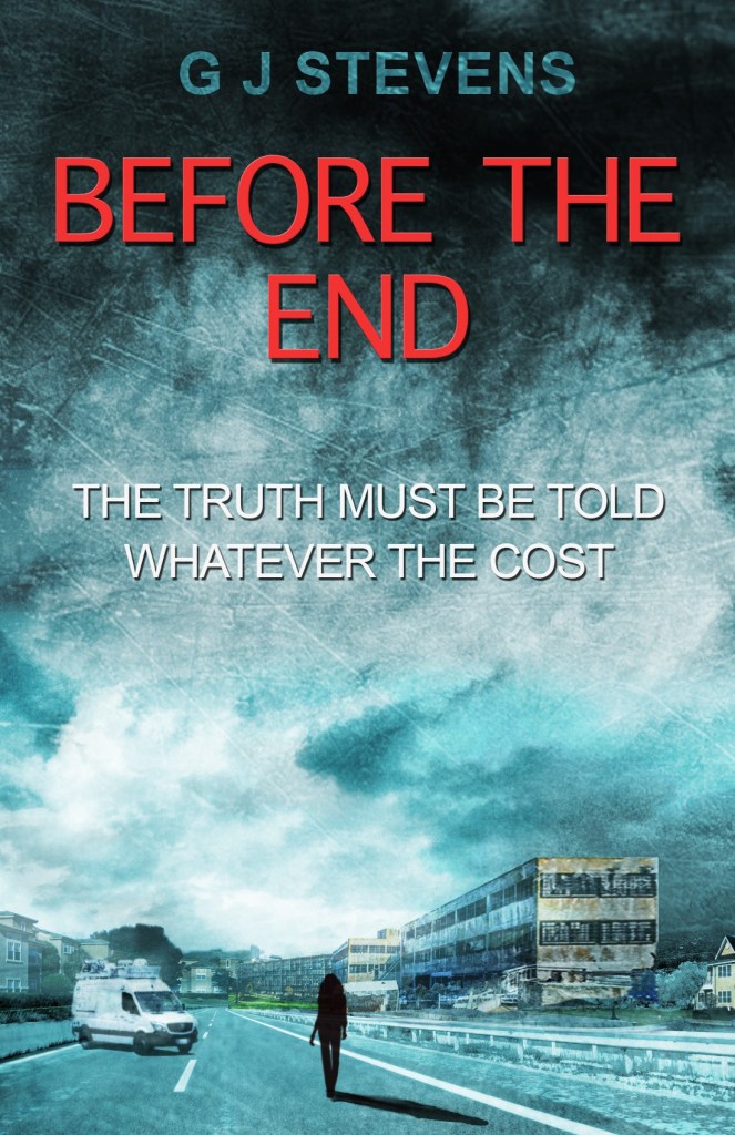
For those of you who regularly follow my publishing journey you will know earlier this month I released my second novel, BEFORE THE END, a standalone sequel to IN THE END.
As with most aspects of the independent publishing process I like to share the inner details. So here we are today with a look at the evolution of the cover for the BEFORE THE END, designed and produced by James Norbury.
James started with my brief which described the ending scene of both IN THE END and BEFORE THE END. I chose this as I hoped it would be familiar to those who had read the first book and would give the right level of context to the story. James then produced the following sketch.
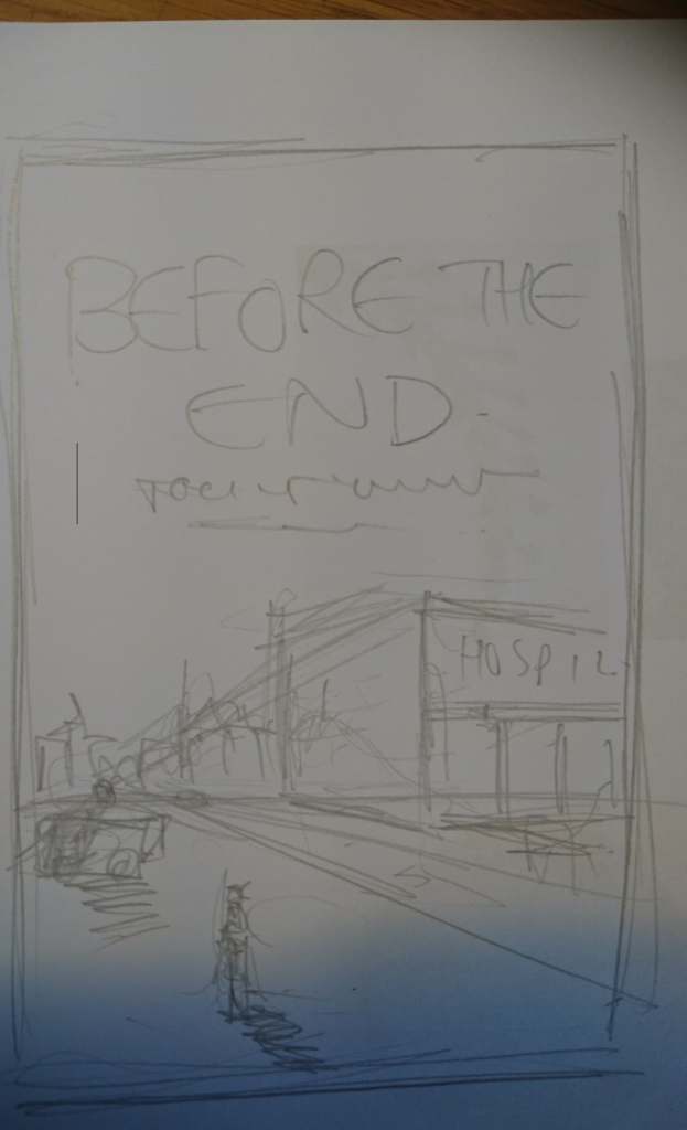
After agreeing the concept he then sent me the following message, asking if he could send his invoice. I should say that I have been friends with James for nearly twenty years, so this didn’t come as much of a surprise! Still, it was on concept.
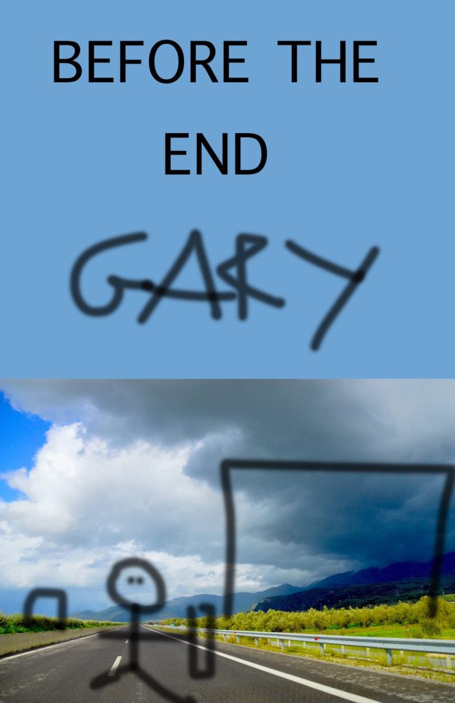
We moved back to the serious business and he fleshed out the sketch. I wanted the book cover to be lighter than that of IN THE END.

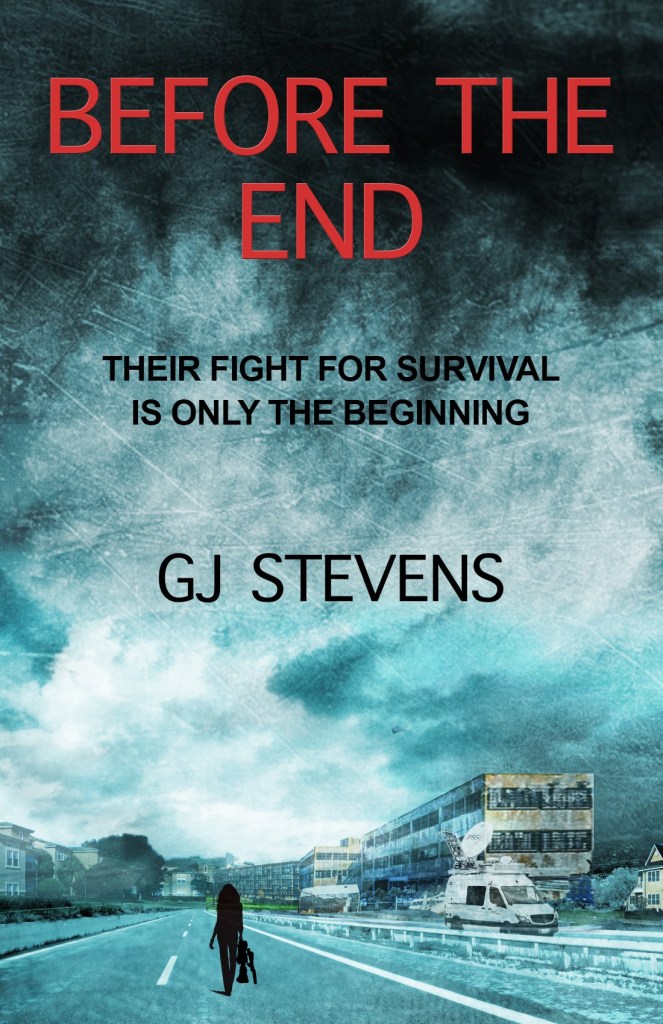
The hospital was too modern and the cover too light but we were getting there. After researching hospital buildings I sent the following images over.

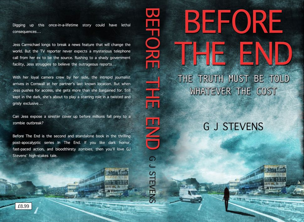
Now we rapidly got to something which is familiar to the finished article.

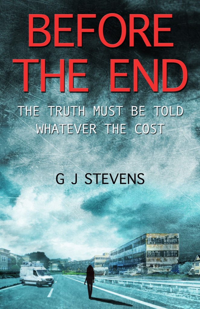
We went through various iterations on the details, looking at the wording and sub title, what the figure would be carrying and how well we could make it look like she was a journalist. James added the news van and after choosing the placement he filled in the details.

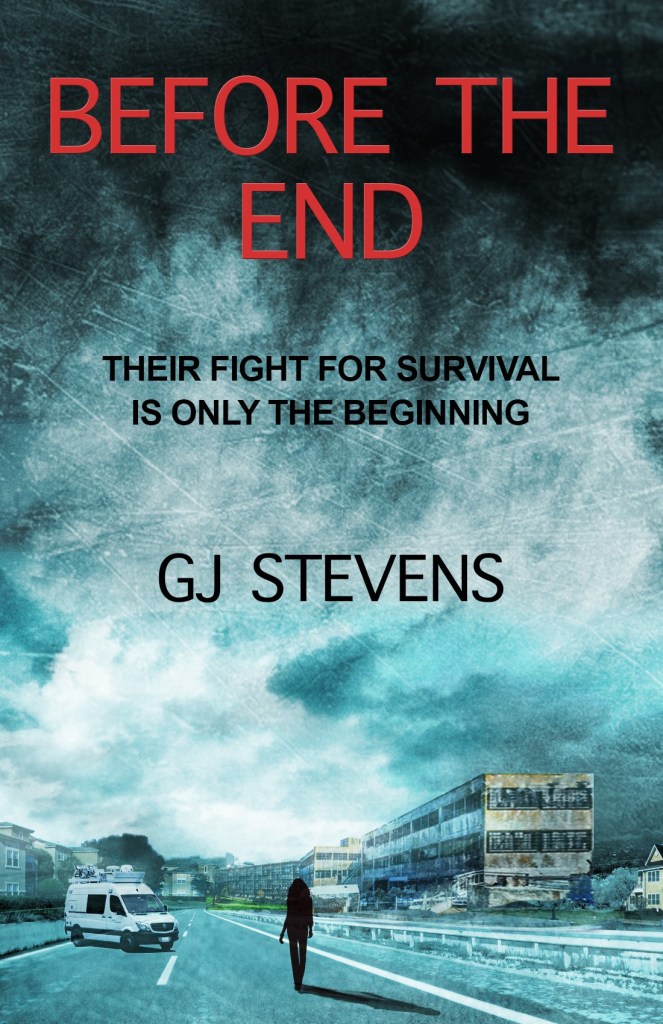
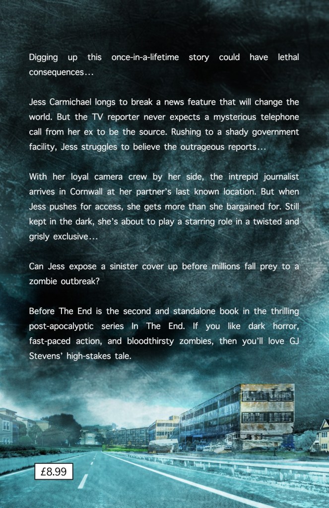
It was then on to the back cover which, as with IN THE END, is a darker version of the front, with the details removed.
Then once the number of pages within the book had been set, after copy editing and its review, he put together the paperback sleeve using the specification from Amazon. The key issue here is that the Amazon printing process means that sometimes the image drifts left or right so the spine can only really be a similar colour to the front and back pages in case it bleeds either way.
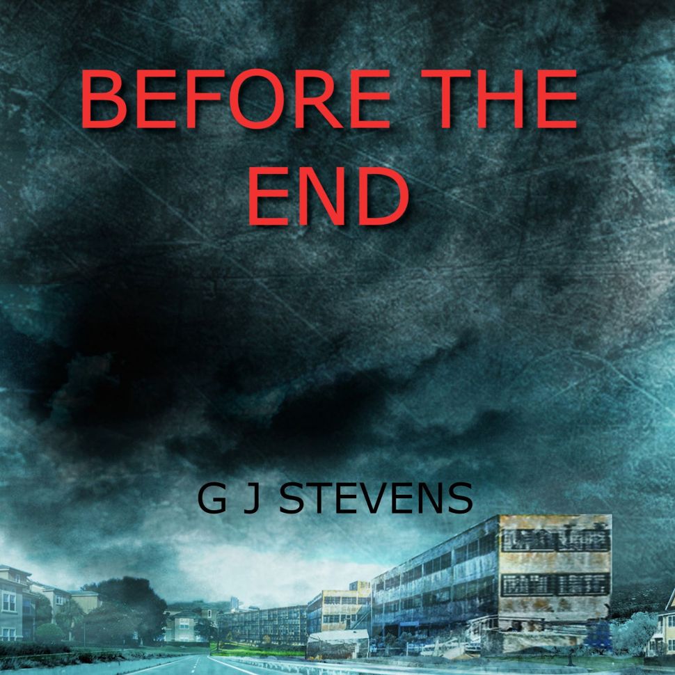
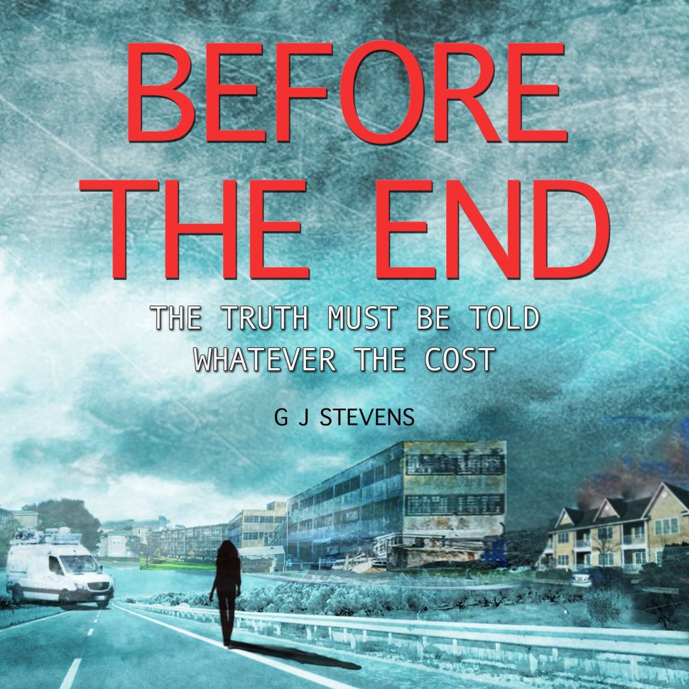
We then played around with the audiobook cover. I was not a straight conversion of the book cover because of the gradient of the light to dark.
That’s about it. The book launched earlier this month and if you want to see it in the flesh then you can check it out here! https://books2read.com/u/b5QvP6
If you want to get any further insights into my journey, then just subscribe to my blog.
Comments welcomed as always!


Nice overview!
LikeLiked by 1 person
Hi GJ,
It’s great to see the process. Great ideas take time.
Thanks,
Gary
LikeLiked by 1 person
Thanks Gary
LikeLike